There are a hundred and one JavaScript charting libraries out there that can do amazing things with your data. Sometimes, though, a whole library is overkill. Libraries come at a cost and for simple charts you can often do what you need without any third party code at all.
Here’s an example of how you can create a bar chart using just HTML and CSS.
The HTML
First off we’ll need some HTML to manipulate with our CSS. You’ll probably be using server side rendering and for this example I was using Razor pages. My .cshtml looked
something like this:
<div class="chart">
  <div class="bars">
    @foreach (var point in Model.Data) {
    <div class="bar" style="height:@(point.ValueAsPercentOfMax)%;"></div>
    }
  </div>
  <div class="labels">
    @foreach (var point in Model.Data) {
    <span class="label">@point.Label</span>
    }
  </div>
</div>
…which outputs HTML like this…
<div class="chart">
  <div class="bars">
    <div class="bar" style="height:50%;"></div>
    <div class="bar" style="height:20%;"></div>
    <div class="bar" style="height:70%;"></div>
    <!-- etc -->
  </div>
  <div class="labels">
    <span class="label">Bar 1</span>
    <span class="label">Bar 2</span>
    <span class="label">Bar 3</span>
    <!-- etc -->
  </div>
</div>
One important thing to note is that we are translating our data values into %age heights on the .bar divs. Combined with some CSS this will turn these divs into the bars in our bar chart.
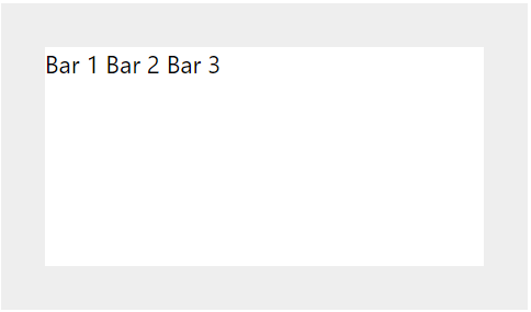
That’s all we need to do for the DOM but so far it doesn’t look great

Let’s add some styles!
The CSS
First things first: we need to be able to see the bars. At the moment the .bar divs have a %age height set but their containing element .bars has zero height. A %age of zero is zero, so no bars!
We want the bars to take up all available space above the labels so let’s turn .chart into a vertical flexbox and set the .bars to flex so they fill up anything left over from the labels.
Note: I’ve given the chart a fixed height & width, but we’ll be writing this so that it will grow or shrink to fit the available space. I’ve also given each
.bara background color so we can see where they are!
.chart {
  height: 100px;
  width: 200px;
  display: flex;
  flex-direction: column;
}

.bars {
  flex: 1;
}

.bar {
  background: red;
}
Now the .bars container is the right height (pushing the labels to the bottom) but we still can’t see them. This time they have height but zero width.
We can get .bars to space it’s components out horizontally, then have each .bar grow to take up the available space with flex: 1. By setting all child elements of .bars to have the same flex value they will all be assigned the same share of the available space.
.bars {
  flex: 1;
  display: flex;
  flex-direction: row;
}
.bar {
  flex: 1;
  background: red;
}
Ok, now we’re getting somewhere: we have bars! We don’t want them at the top though, so let’s set .bars to align it’s items to flex-end to get them to the bottom.
.bars {
  /* ...as above... */
  align-items: flex-end;
}
Better. Those labels need to line up with the columns though, so let’s apply the same horizontal flex to .labels-container. We can add some text alignment and a little padding while we’re about it.
.labels {
  display: flex;
  flex-direction: row;
}
.label {
  flex: 1;
  padding: 3px;
  text-align: center;
}
Much better, but the “big red square” column style isn’t the best. Let’s give each column some padding, border and a nice background color and…
.bar {
  flex: 1;
  border-radius: 3px 3px 0 0;
  background: rgba(98, 144, 200, 1);
  border: 1px solid rgba(55, 105, 150, 1);
  border-bottom: none;
  margin: 0 18px;
}
Pretty good! We just want one final touch to add a bit of polish: animation. We can make our bars grow to their full height as the page loads by animating the translateY property from 100% (i.e. entirely outside the parent element) to 0 (i.e. the desired final position).
@keyframes grow-column {
  0% {
    transform: translateY(100%);
  }
  100% {
    transform: translateY(0);
  }
}

.bars {
  /* ...as above ... */
  overflow: hidden;
}

.bar {
  /* ... as above ... */
  animation: grow-column 1s;
}
We need to set the containing .bars element to hide all overflow content; otherwise we would see the columns sliding in over the top of the labels.

✨ tada! ✨ A nice looking simple bar chart at a cost of a few bytes of CSS!